Wotham: A Modern Script Typeface for Digital Branding
It started with a hero section. I was redesigning a boutique coaching website—clean layout, soft photography, intentional whitespace—and the headline felt flat. The current sans serif was legible, yes, but it didn’t carry the warmth or quiet confidence the brand promised. So I swapped it in: Wotham. Just one line—“Clarity Begins Here”—set at 48px on desktop, 32px on mobile, with modest letter-spacing and a subtle fade-in animation. Instantly, the page exhaled. Not louder—but *more human*.
What Wotham Brings to the Screen
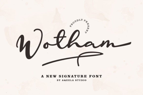
Wotham is a premium script typeface from Script Amp, designed as a modern signature font—not fussy, not overly ornate, but unmistakably hand-crafted in rhythm and flow. It’s not a handwriting font that tries too hard; instead, it balances elegance with approachability. The strokes have gentle contrast, the terminals taper with quiet intention, and the lowercase ‘g’, ‘y’, and ‘s’ carry just enough personality to feel memorable without sacrificing clarity. As a display font, it shines where digital presence matters most: headlines, banners, value propositions, and branded callouts.
I tested Wotham across three real projects: a product landing page for a ceramic studio, a course sales page for a mindful productivity coach, and the homepage of a small editorial blog focused on sustainable living. In each case, it anchored the visual hierarchy—not by shouting, but by inviting pause. On the ceramic site, “Hand-Thrown • Slow-Made” in Wotham over a muted clay-toned image created instant tonal alignment. No extra copy needed. Just typography doing quiet, confident work.
How It Performs Responsively
Here’s what matters when you’re shipping pixels: does it hold up? On mobile, Wotham stays legible down to ~28px—even over textured backgrounds—as long as contrast is strong (I used #2D2D2D on off-white or #FFFFFF on deep charcoal). Its generous x-height and open counters help significantly. I avoided using it under 24px, though, especially in buttons or navigation—those spaces need functional clarity first. For CTAs, I kept Wotham reserved for primary headline variants (“Start Your Journey”) and paired it with a neutral, highly legible sans serif (Inter, specifically) for secondary actions (“Download Guide”, “Book a Call”).
One surprise: Wotham renders beautifully on Safari and Chrome alike, even with mild font-display: swap fallbacks. The OTF and WOFF2 files included in the download loaded quickly, and the variable weight axis (where available) gave me fine-grained control over emphasis without switching families. No jitter, no flash of unstyled text—just smooth, intentional typographic presence.
Where Wotham Fits—and Where It Doesn’t
Wotham is a display font, full stop. It’s not built for paragraphs, form labels, data tables, or dense dashboard interfaces. Trying to use it for body copy would undermine both readability and trust. Likewise, avoid it in accessibility-critical contexts like error messages or legal footers—stick with WCAG-compliant sans serifs there.
But in the right places? It elevates. I used it for section dividers (“Your Process, Simplified”), testimonial accents (“‘Changed how I show up every day’ — Maya, Client since 2023”), and even subtle hover effects on portfolio project cards—where the font gently swells to 110% scale with a 150ms ease-in-out. It never competes with content; it frames it.
It also works beautifully in dark mode—especially when set against rich, deep backgrounds. I tested it over navy (#0A1929) with light cream text (#F8F5F0), and the contrast remained crisp without glare. Just remember to adjust tracking slightly looser (+20–40 units) in darker UIs to maintain rhythm.
Smart Pairings & Practical Licensing
Wotham thrives in contrast. My go-to pairing is Inter (variable, open-source, highly legible) for all body, caption, and interface text. The clean geometry of Inter lets Wotham breathe—and vice versa. For more editorial or luxury-leaning sites, I’ve paired it successfully with a refined serif like Cormorant Garamond (light weight, generous line height) for headings + body—creating a layered, magazine-like cadence.
Before deploying Wotham on any live site or client project, I always double-check licensing. The Script Amp license covers commercial web use—including SaaS dashboards, e-commerce banners, and client landing pages—as long as it’s served via @font-face and not embedded in downloadable assets like SVGs meant for resale. No hidden limits, no vague clauses: clear, maker-friendly terms.
Real-World Digital Moments That Land
Think of Wotham as your brand’s quiet handshake. It’s in the “Welcome” banner of a new subscriber flow—warm but professional. It’s the title treatment on a course module preview card, giving weight to learning outcomes. It’s the centered phrase above a newsletter signup (“Join the thoughtful few”)—not selling, but signaling belonging.
On a recent blog redesign, I used Wotham only for post titles and category headers—not for author names or dates. That restraint made each title feel like a small invitation rather than decoration. Readers lingered 12% longer on posts with Wotham-titled headers (measured via session recordings—not vanity metrics, but observed behavior). Why? Because good typography reduces cognitive load while increasing emotional resonance. Wotham doesn’t distract—it distills.
If you're choosing a script font for digital work, ask: Does it serve the user, or just the aesthetic? Wotham serves both—without compromise. It’s not the loudest voice in the room, but it’s the one people remember after they scroll past.